Every time I've mentioned to folks how excited I've been about the DVD release of Helvetica, the film about the font, not only have I received looks askance, but I've been told that my enthusiasm for this films officially cements my status as a dork. Even really dorky people have called me a dork. *sigh* Well, there IS the exception of the time I mentioned it to one of our graphic designers at work--she promptly pulled out a full-size publicity poster (see below) for the film (I particularly like this girl because she has a "No Comic Sans" bumper sticker tacked to her bulletin board. Here, here!).
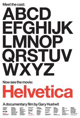
So, I like fonts. What of it? When I worked for the UofA Poetry Center as an all-around grad student grunt, my favorite part of the job was designing all the posters for our readings. Matching font to visiting poet *almost* made it OK that I was making $7.50/hour. That said, I've always been something of a Garamond girl. Sadly, my font of choice is not an option here on Planet Blogger. I love it's little feathery serifs. I love that it's romantic in a Paris-is-the-City-of-Love kind of way. It's bookish and antique-y. It's ladylike. And ladylike-ness, by its very nature, contains the suggestion of its opposite. Like me wearing my Garamond t-shirt (yes, I own such a thing-- I wouldn't lie to you, my faithful flock) sans bra. Clearly, it's a great font.
Now, Helvetica, in and of itself, will never be a style to which I gravitate. It's
Aside from all of the above, I think the real value of this film is that it offers a crash course in how the sign-signifier relationship works. And not just because we're looking at written language, which is, basically, a graphic representation of temporal sounds-- the basic fundament of the semiotic argument as a whole. To deny that there is a difference in meaning between the word... oh, I dunno, let's take "courtesan"-- written in Helvetica and the same word written in Garamond would denote a distinct lack of visual sensitivity on the part of the deny-er. And that difference only occurs because typeface, undeniably, bears some of the weight of meaning-making. Hence, the film becomes a mini-lesson-for-the-non-philosopher in aesthetic theory. And who among us DOESN'T wish we'd had more time to take philosophy of aesthetics classes when we were undergrads?
Jesus. I AM such a dork.
I leave you with this: participate in the non-fiction filmmaking renaissance TODAY! You'll be so glad you did.
I should be getting paid for these plugs.

