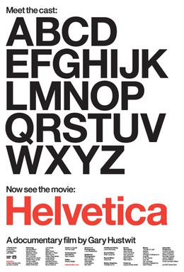
Every time I've mentioned to folks how excited I've been about the DVD release of Helvetica, the film about the font, not only have I received looks askance, but I've been told that my enthusiasm for this films officially cements my status as a dork. Even really dorky people have called me a dork. *sigh* Well, there IS the exception of the time I mentioned it to one of our graphic designers at work--she promptly pulled out a full-size publicity poster (see below) for the film (I particularly like this girl because she has a "No Comic Sans" bumper sticker tacked to her bulletin board. Here, here!).
So, I like fonts. What of it? When I worked for the UofA Poetry Center as an all-around grad student grunt, my favorite part of the job was designing all the posters for our readings. Matching font to visiting poet *almost* made it OK that I was making $7.50/hour. That said, I've always been something of a Garamond girl. Sadly, my font of choice is not an option here on Planet Blogger. I love it's little feathery serifs. I love that it's romantic in a Paris-is-the-City-of-Love kind of way. It's bookish and antique-y. It's ladylike. And ladylike-ness, by its very nature, contains the suggestion of its opposite. Like me wearing my Garamond t-shirt (yes, I own such a thing-- I wouldn't lie to you, my faithful flock) sans bra. Clearly, it's a great font.
Now, Helvetica, in and of itself, will never be a style to which I gravitate. It's
Aside from all of the above, I think the real value of this film is that it offers a crash course in how the sign-signifier relationship works. And not just because we're looking at written language, which is, basically, a graphic representation of temporal sounds-- the basic fundament of the semiotic argument as a whole. To deny that there is a difference in meaning between the word... oh, I dunno, let's take "courtesan"-- written in Helvetica and the same word written in Garamond would denote a distinct lack of visual sensitivity on the part of the deny-er. And that difference only occurs because typeface, undeniably, bears some of the weight of meaning-making. Hence, the film becomes a mini-lesson-for-the-non-philosopher in aesthetic theory. And who among us DOESN'T wish we'd had more time to take philosophy of aesthetics classes when we were undergrads?
Jesus. I AM such a dork.
I leave you with this: participate in the non-fiction filmmaking renaissance TODAY! You'll be so glad you did.
I should be getting paid for these plugs.
2 comments:
My dearest Marjorie,
You are indeed a dork, and that is one of your most adorable qualities. This is one of those rare instances where we agree on any art form. (Yes, I am such a nerd that I consider typography an art form.) I have always preferred serif fonts, especially those with swashes. Goudy Old Style, Benguiat, and the like. The way the capital R's leg runs under the next letter or two, and the upper case T stretches out to embrace what follows. It is a thing of beauty to those who see it as such, as you remain a thing of beauty to me. Love, j
Isn't Goudy Old Style a derivative of Garamond anyway?
Well, well, we were bound to agree about something sooner or later, weren't we? You're absolutely right. I AM friggin' adorable!
Post a Comment